Description
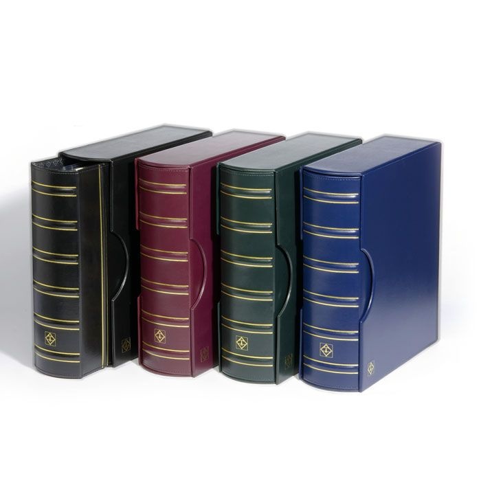
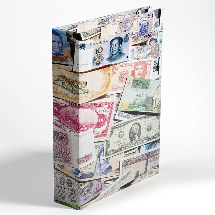
For the first time ever a collectible set of Numis albums designed specifically for every Bank of Canada banknote. A total of EIGHT albums will be available for the following “Series” of Bank of Canada notes:
- 1935 Series — Bank of Canada first set of banknotes
- 1937 Series — Bilingual banknotes added
- 1954 – Series — “Devil’s Head”
- 1954 – Series — Modified Notes
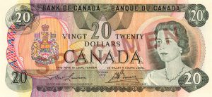
- 1969-1979 Series, Scenes of Canada
- 1986 Series, Birds of Canada
- 2001-2006 Series, Canadian Journey
- 2011-2013 Series, Polymer
Each complete album in classic design comes with matching slipcase. The leatherette binder in bookbinders’s quality features a 4-ring mechanism. Size: 9 x 9 1/4″ (230 x 235 mm).
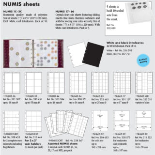
Album that INCLUDES 5 Numis 2C sheets to hold 10 raw notes PLUS 5 1C sheets to hold 5 Graded Notes
Numis sheets are also available separately. See link below.
The banknote albums hold 20 Numus sheets in total.
Below are more details on each Series, from the Bank of Canada website:
1935 Series:
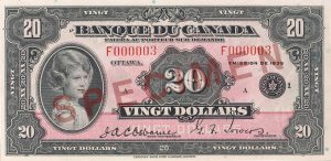 The Bank of Canada was founded in 1934 and given responsibility, through an Act of Parliament, to regulate the country’s money supply and to “promote the economic and financial welfare of Canada.” Accordingly, it was also given the exclusive right to issue bank notes. On 11 March 1935, the Bank of Canada issued its first series.
The notes were unilingual, and matching versions of all denominations were available in either French or English. Also unique to the series were a $25 and a $500 note. The series featured portraits of various royals and former Canadian prime ministers. On the backs of the notes were allegorical figures symbolizing Canada’s growing agricultural, industrial, and commercial prosperity.
The security features included raised ink, which was thick and easily felt (on the front and back), intricate fine-line patterns, and small green dots (planchettes) scattered randomly in the paper.
1937 Series:
The creation of a second series of bank notes, only two years after the first, was prompted by changes in Canadian government legislation that required the Bank of Canada to produce bilingual bank notes.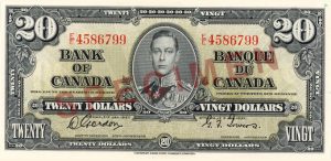
The portrait of King George VI was used on all denominations in this series except for the $100 and $1,000 notes, which featured former Canadian prime ministers. Other departures included colour variations and the central location of the portrait, bordered by English and French text.
Security features included raised ink, which was thick and easily felt (on the front and back), intricate fine-line patterns, and small green dots (planchettes) scattered randomly in the paper.
1954 Series:
Design changes to this third series of Bank of Canada notes included moving the portrait off centre and to the right, simplifying the line work, and integrating Canada’s coat of arms into the background design.
Raised ink (intaglio), which could easily be felt, was used extensively on both sides of the notes in this series. Black ink was used for the text, portrait and border designs on the front; a different colour (a unique one for each denomination) was used for the landscapes and border designs on the back.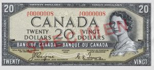
The term “Devil’s Head” is commonly used to describe this series. The notes caused quite a controversy because, in the engraving of the portrait, an area of the Queen’s hair gave the illusion of a grinning devil. Modifications to the printing plates for all denominations were made in 1956 to exorcise the demon!
1969-1979 Series, Scenes of Canada:
Often dubbed the “multicoloured series,” these bank notes were released beginning in 1969 in response to growing concerns about counterfeiting.
The main characteristic of the design was the use of multicoloured tints beneath the dominant colour. Known as “rainbow printing,” this process subtly merged two or more colours into each other. The colour technique was designed to thwart counterfeiters.
1986 Series, Birds of Canada:
The Birds of Canada series was designed about thirty years ago with security features to counter the colour photocopiers of that era. Of note was the introduction of an optical security device (a metallic patch that shifts from gold to green) and larger portraits that facilitated viewing the fine-line work in the face and hair. 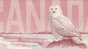
This was the last series to include the $2 and $1,000 notes:
- In 1996, the $2 note ceased being issued and was replaced by a more durable coin.
- In 2000, the $1,000 note was withdrawn from circulation.
Both denominations remain legal tender.
Canadian Journey Series (2001-2006):
This series incorporated security features never before seen in Canadian bank notes. Canadian Journey notes were distinguished not only by enhanced security features, but also by world-class designs and the introduction of a tactile feature to help the blind and partially sighted to identify the different denominations. 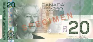
The Canadian Journey $20, $50 and $100 notes were introduced in 2004, and the $5 and $10 notes were upgraded in 2005–2006 so that the same suite of security features appears on all five denominations. The original $5 and $10 notes of the Canadian Journey series (2001-2002) had different security features that did not include a metallic stripe, ghost image, dashes, or a puzzle number.
2011-2013, Polymer Series
Canadian bank notes are now printed on polymer—a smooth, durable film. The $5, $10, $20, $50 and $100 polymer notes have leading-edge security features that are easy to verify and hard to counterfeit.
Polymer notes last at least 2.5 times longer than cotton-paper notes,
saving money in processing and replacement costs. These notes combine transparency and holography to make for one-of-a-kind currency. Because polymer notes last longer, they will have a reduced impact on the environment compared with cotton-paper notes. They are also recylable.


Reviews
There are no reviews yet.